The frontend this site
is made of, with the parts taken out and left running.
Each of these is in use somewhere else on the site. They
are reproduced here as something you can operate rather than read about,
with the code that does it underneath. If one of them breaks, it breaks on
the page that documents it.
01
A type scale that is a formula, not a list
Every size on this site comes from one modular scale: a perfect fourth
at the top of the viewport range easing to a minor third at the bottom.
Drag the handle to move the viewport width and watch the ratio between
the sizes change, not just the sizes.
Picking sizes by eye produces a set that works at one width. A scale
built from clamp() produces a set that holds its relationships at every
width, and the reason the headline can run at 7rem on a desktop without
flattening a phone is that the ratio itself narrows as the screen does.
Aa 3.05rem
Aa 1.84rem
Aa 1.13rem
The code
--step-0: clamp(1.00rem, 0.95rem + 0.24vw, 1.13rem);
--step-2: clamp(1.44rem, 1.30rem + 0.71vw, 1.84rem);
--step-4: clamp(2.07rem, 1.72rem + 1.76vw, 3.05rem);

/* The preferred term is where the ratio lives: a larger vw
   coefficient on a larger step is what makes the scale
   compress on a narrow screen instead of scaling uniformly. */
02
Letting the browser break the line
Two CSS properties decide where text wraps. balance
evens the lines of a short heading; pretty stops a paragraph
ending on a single orphaned word. Toggle them.
Headings that break one-word-on-the-last-line are the most common
typographic fault on the web, and it used to need JavaScript measuring
text to fix. It is now two declarations, and the browser recomputes them
on every resize for free.
A headline long enough to break across more than one line
A paragraph is a different problem from a heading. Here the
risk is not an uneven rag but a final line carrying one lonely word, which
is what pretty exists to prevent.
The code
h1, h2, h3 { text-wrap: balance; }   /* even the rag */
p          { text-wrap: pretty;  }   /* no orphans   */
03
Components that size to their container
A project card appears in three places on this site at three
different widths. It does not ask how wide the window is; it asks how
wide its own container is. Drag the edge.
A media query is a question about the viewport, which is the wrong
question for a component that can be placed anywhere. Container queries
let one card be correct in a wide grid, a narrow sidebar and a 404 page
without three sets of overrides.
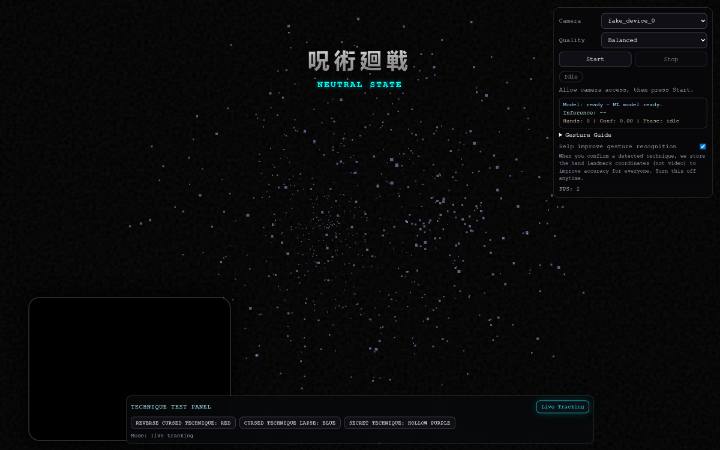
SAT0RUHand-tracked visualiser with an ML classifier.
The pointer position is written into two custom properties on the
element under it, and a radial gradient is drawn from them. Move over the
panel.
Custom properties cross the boundary between script and style, so the
only thing JavaScript does here is report coordinates. All of the
rendering stays in CSS, which means it stays on the compositor, and the
whole page shares one listener rather than one per card.
Move the pointer across this panel
The code
.panel::after {
  background: radial-gradient(
    260px circle at var(--mx, 50%) var(--my, 50%),
    color-mix(in srgb, var(--accent) 16%, transparent), transparent 70%);
}

/* one delegated listener, coalesced to a frame */
document.addEventListener("pointermove", e => {
  const el = e.target.closest(".panel"); if (!el) return;
  const r = el.getBoundingClientRect();
  el.style.setProperty("--mx", (e.clientX - r.left) / r.width * 100 + "%");
  el.style.setProperty("--my", (e.clientY - r.top) / r.height * 100 + "%");
}, { passive: true });
05
Loading an image without moving the page
A ~20 byte blurred copy of every screenshot is inlined into the HTML
and painted immediately; the real file fades over it once decoded. Press
replay to watch it happen.
An image with no placeholder is either a blank gap that shifts the
layout when it lands, or a spinner. A blur-up costs almost nothing,
reserves the exact space through the aspect ratio, and makes the wait
look deliberate. It is most of why this site's layout shift is 0.013.
The real text stays in the DOM and holds the box; an aria-hidden
layer sits exactly on top of it and scrambles. Press replay.
The effect is the easy part. What makes it shippable is that the
animated layer never changes the measured width, so a headline at 7rem
cannot reflow mid-animation, and that under reduced motion nothing is
constructed at all: the correct version is the markup that was already
there.
Interfaces that hold their frame rate
The code
/* the real text holds the box, the overlay is painted on top */
.decode { position: relative; display: inline-block; }
.decode--running { color: transparent; }
.decode__layer { position: absolute; inset: 0; color: var(--text); }

if (matchMedia("(prefers-reduced-motion: reduce)").matches) return;
07
Serving the right image to the right screen
The hero screenshot is a 1600px master and a 720px derivative. Your
browser picked one before this page finished parsing. Which one it took
is below, read back from the DOM.
Sending a 1600px file to a 390px phone was costing this site about
44 kB on its largest-contentful-paint element. The srcset alone does not
fix it: without a sizes hint the browser assumes the image is full-width
and takes the master anyway.